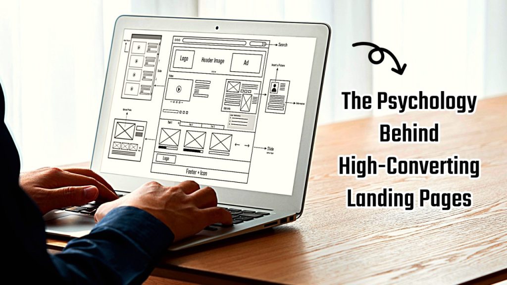
When visitors land on your website, you have just a few seconds to capture their attention and convince them to take action. Whether it’s booking a service, requesting a quote, or signing up for a free consultation — every click matters.
But what separates an average landing page from one that converts visitors into paying customers? The answer lies in psychology — the subtle cues, colors, words, and design elements that trigger emotional responses and decision-making behavior.
In this article, we’ll explore the science-backed principles behind high-converting landing pages and how you can use them to increase your conversions and sales.
Why Psychology Matters in Marketing
At its core, marketing is about understanding human behavior. Every image, headline, and call-to-action on your landing page influences how a visitor feels — and ultimately, what they do next.
Psychology helps you connect emotionally, reduce doubt, and guide users naturally toward a conversion. Instead of pushing people to buy, you’re helping them feel confident in choosing you.
Neil Patel often says that people buy based on emotion and justify with logic later. That’s why successful landing pages don’t just share features — they tell a story, build trust, and make visitors feel understood.
1. The Power of First Impressions
According to multiple UX studies, it takes only 0.05 seconds for a user to form an opinion about your site. That’s faster than a blink — which means your design, layout, and visuals must instantly communicate clarity and credibility.
Here’s how to create a powerful first impression:
- Use clean, modern design with high-quality images.
- Keep text short and easy to read above the fold.
- Include your unique value proposition (what makes you different) immediately.
- Remove clutter and avoid too many distractions or links.
If your landing page looks trustworthy and professional, visitors are more likely to stay and explore.
2. The Psychology of Color
Color is one of the most powerful psychological tools in web design. It influences emotions, associations, and actions. For example:
- Blue communicates trust, calmness, and reliability (often used by financial and healthcare brands).
- Red creates urgency and excitement, making it perfect for limited offers.
- Green is associated with health, nature, and positive actions like “Go” or “Start.”
- Orange can encourage enthusiasm and attention — often used for CTA buttons.
When choosing colors, consider your target audience. For instance, if you’re designing for a medical spa, calming tones like blue and white work better than bold red or black.
Neil Patel’s landing pages often use high-contrast CTAs — for example, an orange “Get Started” button on a white background — to immediately draw attention.
3. Clarity Over Creativity
One of the biggest mistakes businesses make is overcomplicating their landing page messaging. Visitors should instantly understand what you offer and why it matters.
The best converting landing pages use clarity-driven copywriting:
- Headline: clear benefit statement
- Subheadline: a short explanation that supports your offer
- CTA: direct and action-oriented
Example:
Headline: “Get More Leads with Data-Driven SEO”
Subheadline: “Our Boise-based marketing experts help your business rank higher, attract traffic, and convert visitors into customers.”
CTA: “Schedule a Free Consultation”
No jargon. No confusion. Just a clear promise and an easy next step.
4. The F-Pattern and Visual Hierarchy
Eye-tracking research shows that people read web pages in an F-shaped pattern — scanning from top left to right, then down the left side.
To design for this behavior:
- Place your key message and CTA at the top left or center.
- Use bold headlines and bullet points to guide the eye.
- Keep paragraphs short (2–3 lines max).
- Use directional cues like arrows or images facing toward your CTA.
When your layout aligns with how people naturally scan, they find what they need faster — leading to higher conversions.
5. Social Proof and Trust Signals
People trust other people more than they trust brands. That’s why social proof is essential.
Add these elements to build trust instantly:
- Customer testimonials and reviews (especially with names or photos)
- Logos of brands you’ve worked with
- Case study stats like “+320% traffic in 3 months”
- Trust badges or certifications (like BBB, Google Partner, or HIPAA compliance)
When visitors see that others have had positive results, their hesitation decreases — and your conversions rise.
6. The Principle of Reciprocity
Humans naturally want to return a favor. In marketing, this is called the reciprocity principle.
When you give visitors something valuable for free — like a downloadable checklist, free consultation, or discount — they’re more likely to give something back (like their email or contact info).
Example offers that convert well:
- “Free SEO Audit”
- “Download Our 2025 Marketing Plan Template”
- “Book a Free 15-Minute Strategy Call”
These small acts of generosity help you build relationships and move prospects further down your funnel.
7. The Power of Urgency and Scarcity
Another key psychological driver is FOMO — the fear of missing out.
When people believe an offer is limited, they act faster. You can use urgency and scarcity responsibly by showing real-time availability or time-based offers.
For example:
- “Offer Ends in 24 Hours”
- “Only 3 Spots Left for October Consultations”
- “Join 200+ Business Owners Who Already Signed Up”
This technique works best when it’s genuine — fake scarcity can harm trust and backfire.
8. Reduce Cognitive Load
Cognitive load is how much mental effort it takes for users to process information. The higher it is, the more likely visitors will leave.
To lower cognitive load:
- Keep your design minimal.
- Use one primary call-to-action (not five different buttons).
- Avoid unnecessary popups or distractions.
- Break content into short, readable chunks.
When users don’t have to “think too hard,” they’re more likely to take action.
9. Consistency Between Ad and Landing Page
If your traffic comes from ads, your landing page must match the message that users clicked on.
This psychological concept is called message match, and it increases conversions by reinforcing the promise that led them there.
For example:
If your Google Ad says “Free Marketing Consultation for Boise Businesses,” your landing page should clearly repeat that same offer in the headline — not something different.
Consistency builds confidence. Inconsistency creates doubt.
10. Emotional Triggers in Copywriting
Emotion drives decision-making far more than logic. That’s why words matter.
Use emotional triggers to make your copy more persuasive:
- Fear: “Don’t let your competitors outrank you.”
- Desire: “Imagine doubling your traffic this month.”
- Trust: “We’ve helped 500+ small businesses grow online.”
- Belonging: “Join thousands of entrepreneurs choosing smarter marketing.”
By tapping into emotions, your message feels personal — not robotic.
11. A/B Testing: The Secret Weapon of Top Marketers
Even with all these principles, there’s no one-size-fits-all solution. That’s why the most successful marketers run A/B tests on their landing pages.
You can test:
- Headline variations
- CTA colors and placement
- Form length
- Hero image or background video
- Testimonials placement
Neil Patel himself recommends testing one variable at a time. Small tweaks often lead to massive gains in conversion rate.
12. The Role of Page Speed and Mobile Experience
No matter how persuasive your page is, if it loads slowly or looks bad on mobile, people will bounce.
Google’s research shows that if a page takes more than 3 seconds to load, 53% of visitors leave.
Here’s how to optimize:
- Compress images without losing quality.
- Use lazy loading and caching.
- Ensure your forms and buttons are thumb-friendly on mobile.
- Test using Google PageSpeed Insights.
Fast, mobile-optimized landing pages not only convert better but also rank higher in search results.
13. Using Storytelling to Create Connection
People remember stories — not features. By weaving storytelling into your landing page, you create a deeper emotional connection.
A simple formula you can use:
- The Problem: Describe your visitor’s pain point.
- The Solution: Introduce your product or service as the answer.
- The Transformation: Show how life improves after taking action.
This technique keeps users emotionally engaged and helps them visualize success with your brand.
14. Keep Your CTA Simple and Action-Focused
Your call-to-action is the finish line of your landing page. Every design choice should lead users toward it.
Effective CTAs are:
- Short (2–4 words)
- Verb-driven (“Get Started,” “Claim My Offer,” “Schedule Now”)
- Visually distinct with a high-contrast button color
Bonus tip: Add microcopy under your CTA for reassurance, like “No credit card required” or “Takes less than 30 seconds.”
15. Final Thoughts: Psychology Is the Key to Conversion
Building a high-converting landing page isn’t just about design — it’s about understanding what motivates people.
By applying these psychological principles — clarity, emotion, trust, urgency, and simplicity — you transform a static webpage into a persuasive experience that guides users naturally toward conversion.
At Boise Marketing Masters, we use data-driven insights and proven marketing psychology to craft landing pages that not only look good but also perform exceptionally well.
If you’re ready to turn more visitors into loyal customers, start by optimizing your landing page strategy today.
